

I like the new version of the last two, but old for the rest
The camera app and spreadsheet app? Because that’s what i would’ve guessed they were based on the icons
those are Meet and Calendar.
I just stopped using most of them
I stopped a time ago. Interestingly, the thing I miss most is maps. That sheer amount of user data paves the path for a fine traffic estimation.
What I see:
💩 💩 💩 💩 💩
Hey show some respect! A whole team of people each racked up tens of thousands of dollars of student loanb debt and spent months tweaking their designs, just for upper management to wreck it all on a whim in order to get you those new icons.
What’s three font used in the heading? Is it some flavour of Helvetica?
Grotesk maybe. The curve of “h” doesn’t seem to go high enough. Otherwise pretty close.
Man… I might be showing my age, but checking out some of the links in these replies gave me nostalgia for the website FontsnThings.com (or was it “FontsandThings”?). I used to love browsing that shit as a kid and downloading all the coolest looking fonts lol
Anyone else?
My wife really really really wanted a MacBook in 2020 and the major plus is of having it is that I got to steal all the fonts. Mostly, I just wanted Helvetica lol
Probably Roboto.
It certainly looks a lot like Helvetica. Probably could be any of these Helvetica clones:

I will also say that it feels a lot like Inter to me, which it’s not as the i-dots aren’t round, but maybe you’ll enjoy that one anyways…
It does not seem to have consistent kerning.
There’s always a yoyo effect with design. I fully expect Google to swing back to gothic palette and highly detailed icon within the next decade.
I don’t love the difficulty of extremely fast individual identification but there is something to be said for the ease of extremely fast collective identification, it makes it very easy to see which group of apps each app belongs to, which is also valuable.
Except this is not “browsers” group or “email clients” group, this is “vertical monopoly” group.
Plus the art they started using in gdrive. The art on its own is cool but within the Google ecosystem just feels like… what is it even… why… ugh I hate it.

Corporate Memphis. It’s an art style a lot of people hate, and I can understand why.
I’ve recognized this style as a generic corpo art, but never had a name to put to it. Thanks for that.
Sanitized, pandering, and insincere, Wikipedia describes it perfectly.
Yeah like in 50 years I can absolutely imagine people loving it as a style of a time. I recognize I like pop art far more than I would if I was in its target demographic. But also I don’t hate it, it’s just so everywhere and so soulless. It’s the style of “money please” in a time of great socioeconomic inequality. It’s art deco but demanding friendship and comfort rather than respect and awe. But more than anything it’s art for business people, and I just don’t care for business people.
soulless corps trying to seem friendly, that’s why
Corporate Memphis
Link for the lazy: https://en.wikipedia.org/wiki/Corporate_Memphis
I am actually quite fond of this style, though this might be controversial
prevent body shaming by only showing obese/disfigured people so society accepts it as a healthy norm
Slow down there, Dr. Gall…
Corporate memphis does incorporate a sort of identity vagueness.
Almost all human features, body, skincolor are in a uncanny valley. Non-personal enough to be general yet similar enough to be relatable to pretty much any theoretical demographic.
In reality it falls flat. Many people (non partisan) dislike it because of how artificial and shallow it feels.
What it is definitely not is a deep plot to change the social perception of checks note people with non idealistic body features.
Google has no economic insensitive to improve your opinion of disabled people who are equally part of this group you appear to find non acceptable to exist in the workforce.
Google has no economic insensitive
“Economic incentive”, right?
My english is self taught, i’ll take your word for it! (Pun intended)
Ah in that case insensitive (in+sensitive) is a synonym to rude. Incentive is closer to reward.
i see the new icons wanna intergrate googles colors ngl
Triumph of visual design over interactive design. These days, most “designers” only care about graphics visually. The much deeper science of how people use and understand things is beyond them. Worse, they think the problem is that everybody else does not “get” visual design.
Style over substance.
Worse, they think the problem is that everybody else does not “get” visual design.
This means they didn’t even make good design. Another example is KDE vs GNOME.
KDE: “We just did system we wanted.”
GNOME: “No, you don’t get it, this is design!”
Case in point: Every single thing Microsoft is doing in Windows these days.
Remember way back when, when you could set icons to be whatever you want?
oh yeah, everything is a pirate ship!
Its one of those things u never think about as a person without disabilities, cuz i can tell the difference just fine, i guess they should have consulted someone with a vision impairment when considering stuff like this.
In case you want to feel old, this change happened almost 10 years ago now fellow grandpas.
Bro what
Damn, my 30s flew by if 2020 was 10 years ago
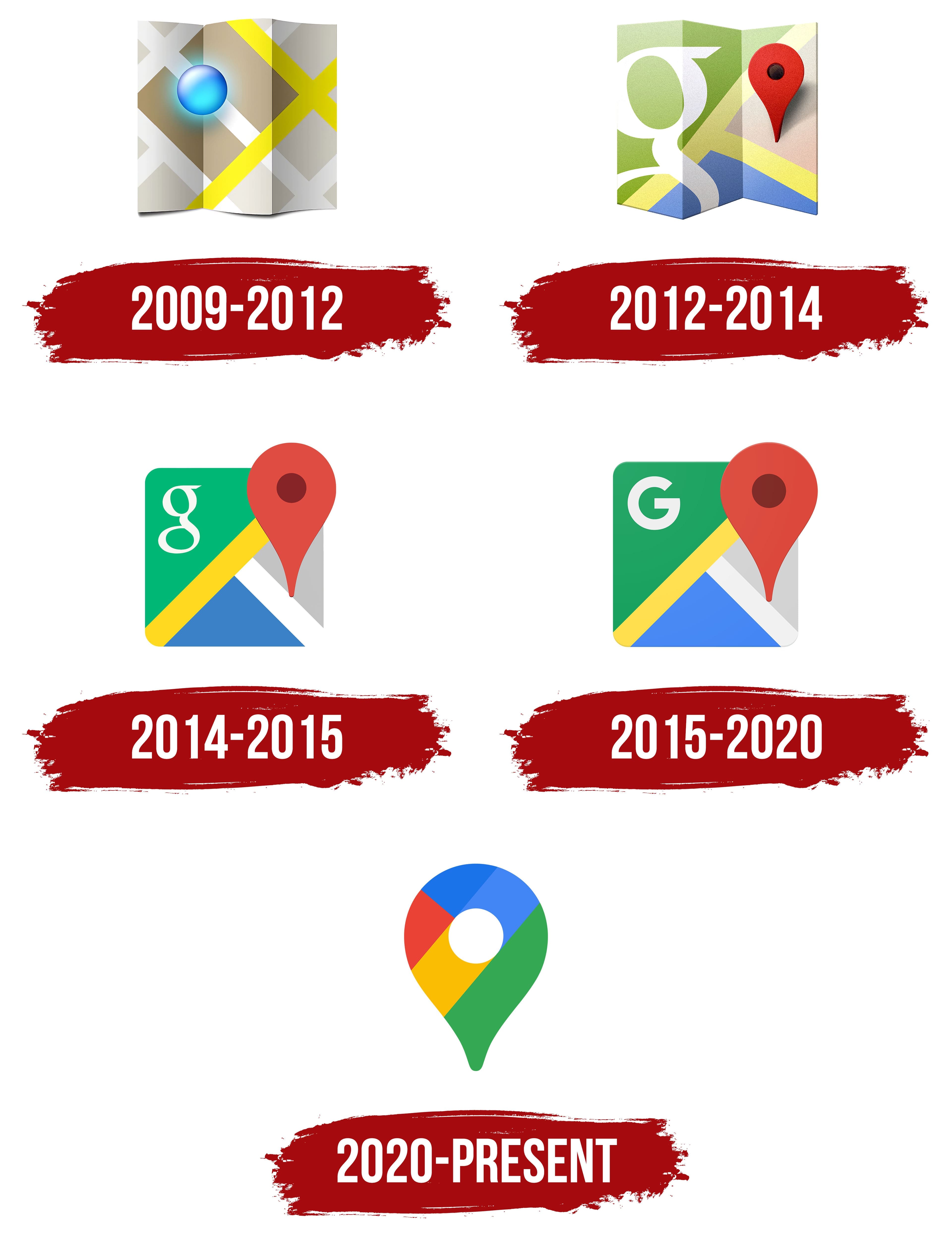
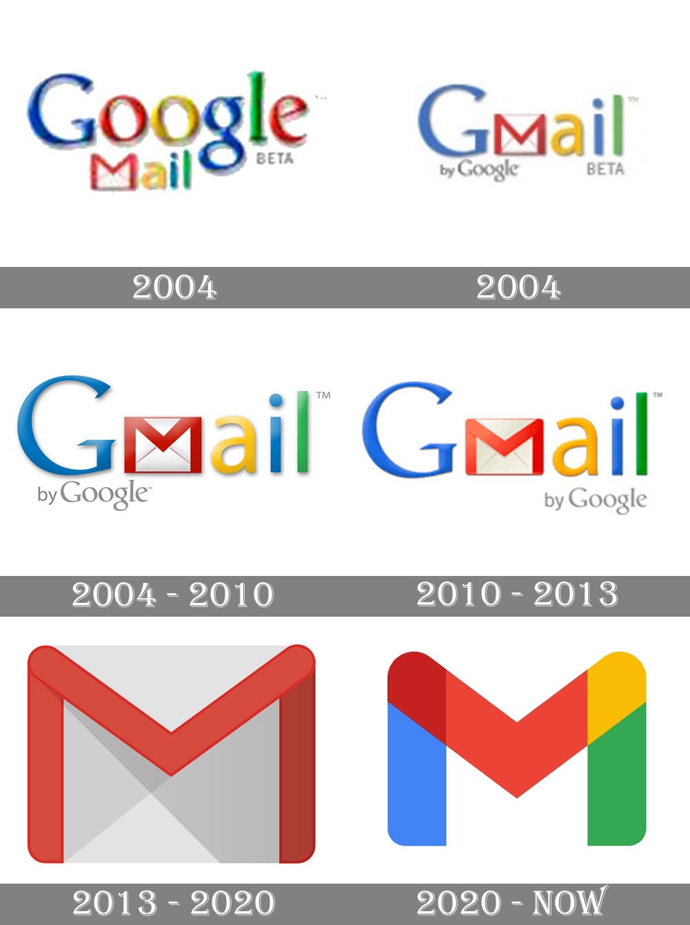
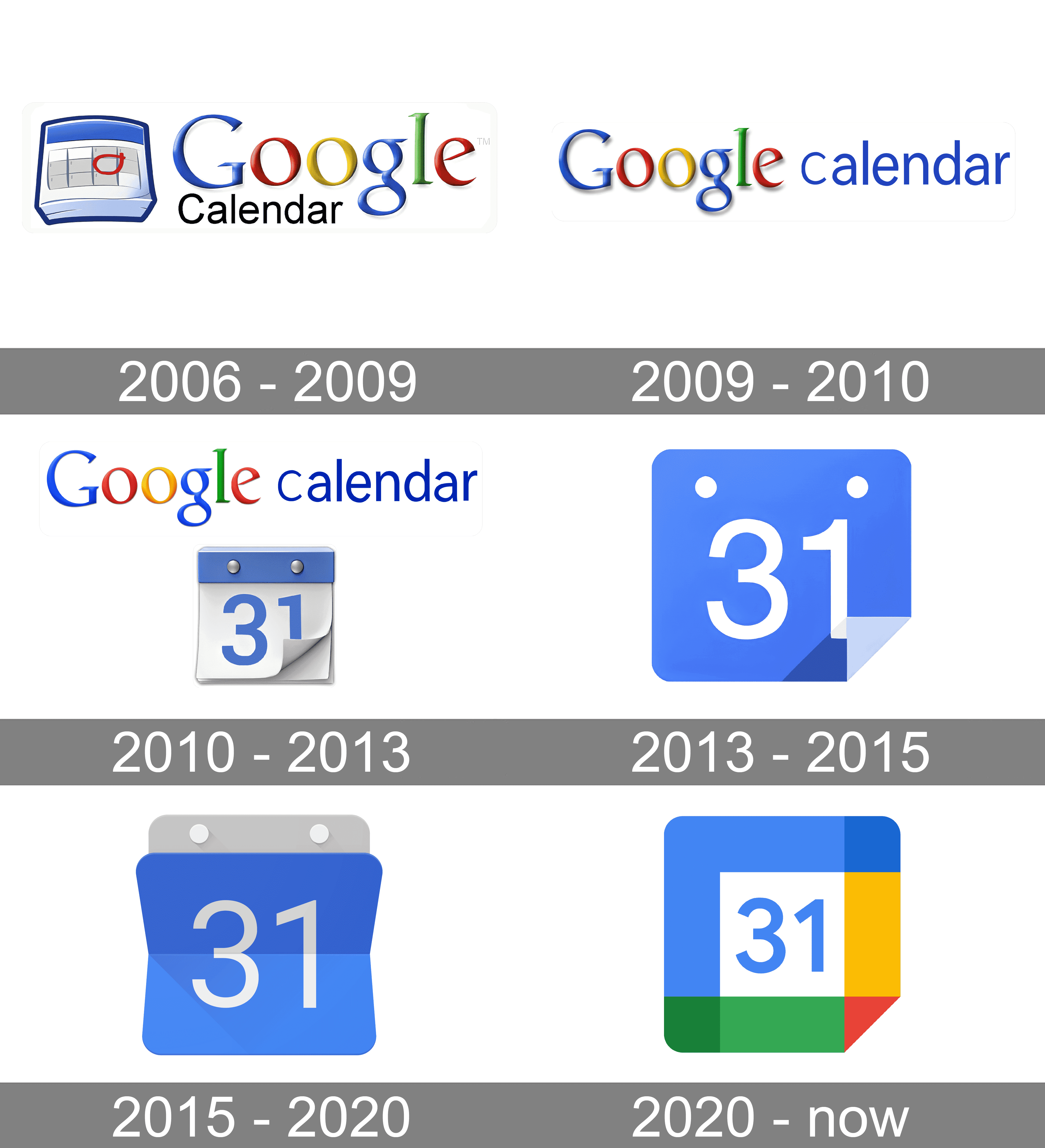
Ok so for me it’s the 2012 maps logo, the 2013 gmail and the 2015 calendar logo.
I confused it with their other branding changes from 2015, who cares I don’t use google anymore lol
On top of that in Play store lots of times when I search for certain app it gives me like 10 more alternatives that all have slightly different logo but all use that same yellow-green-blue-red color palette that google has, so with all these copycats it’s even harder to figure out whether app is from google or not
I wouldn’t even call this “aesthetics”. Rather “conceptual homogeneity” or something like that. It’s what happens when you strive for a uniform look over a useful or visually pleasing one.
Even uniformity can be aesthetically pleasing, but these icons are decidedly not.
In some countries uniform look at least provided good for society. In this case it provides only profits for to 1%.
Good for society:


