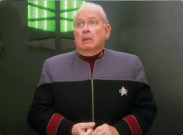
How dare I polish and remove kludges from previous releases. 😆
Also, none of those kludges would have even been necessary if the project scope was properly defined from the start and the project manager didn’t let the users keep trickling in new requirements without also extending the deadline.
So yeah, how dare I go back and implement something the way it should have been done the first time?


Sometimes this is true, but sometimes UI updates really are just bad. Euro Truck Simulator 2 redid its UI in 1.50 and it’s so much harder to use. Everything used to just be convenient buttons and information on the main menu, now everything is in really confusing menus and even though it’s been out for a few months now I still have so much trouble using it and it feels so good to go back to an older version with a good UI. (Also the new UI is just horrendously ugly because they made everything completely flat but that’s just personal taste I guess)