
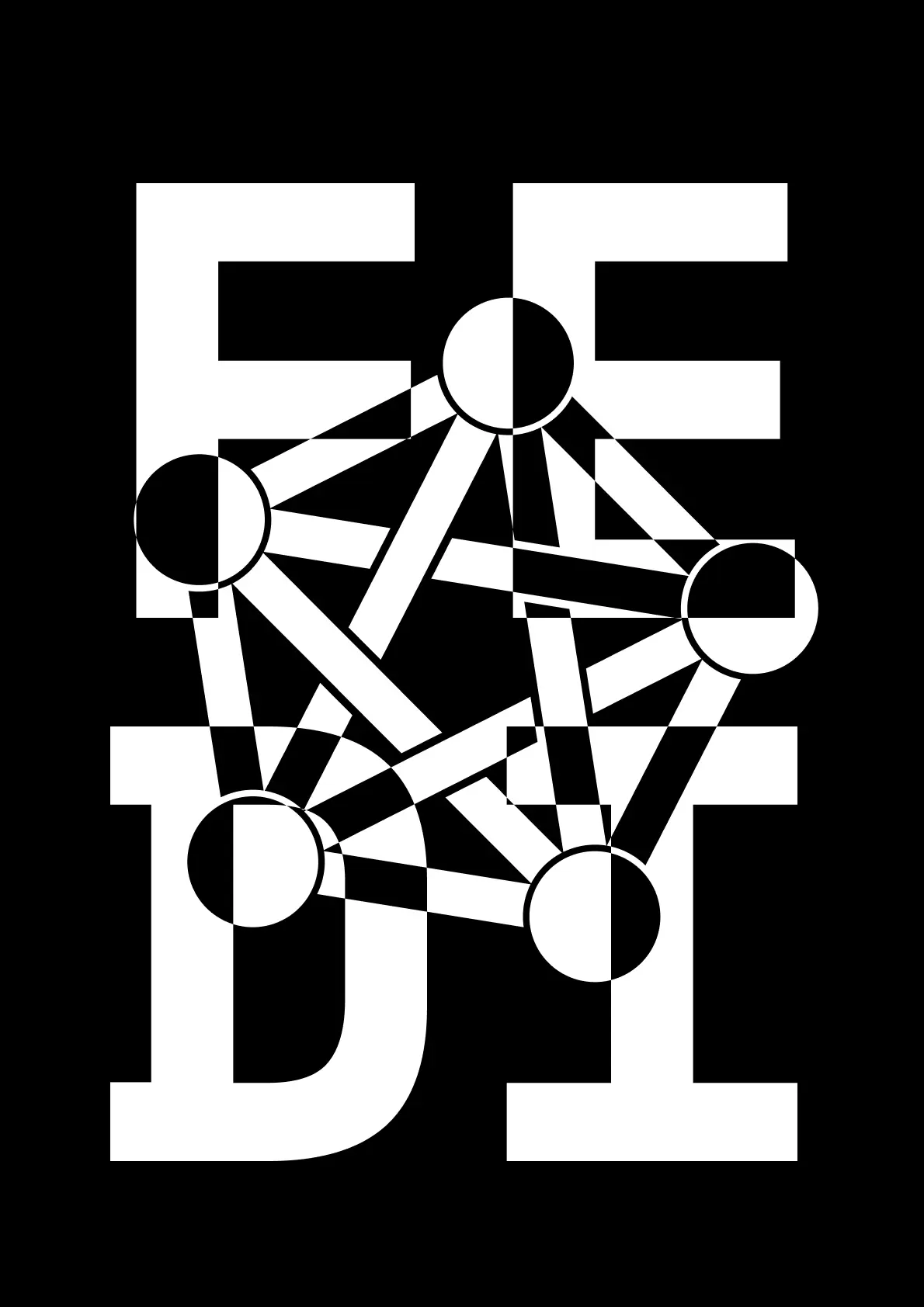
A poster I made to promote the Fediverse.
The PDFs and the light version is on the Internet Archive.
This work is public domain, so feel free to do whatever you want with it; for example print it on a T-shirt!
EDIT: Low-contrast Solarized versions are now available!
That looks like an Iain Banks non-sci-fi book jacket
Wow this would look really cool on a t-shirt / hoodie
I like it
Neat!
Each one of the circles could be an icon for the different mainstays
-Lemmy
-Mastodon
-Pixelfed
-Kbin/Mbin
-?The main problem with that is that most of these platforms barely communicate with each other. I think mbin right now has the best multi platform support but even that is somewhat lacking.
Perhaps lower the contrast a bit? Use some gray and charcoal color? Presently it looks like what I see when I have migraine aura… and I don’t intend that to be mean or anything!
Fair enough, I will make another version shortly
Solarized dark looks great!
I wish I could say this is great, but it’s an unreadable mess. Looks like EEDT.
I saw FFDI. Not much better.
That’s what I saw too at first
deleted by creator
Sort of vaguely op-art. Or postmodern brutalist perhaps.
It could be a bit better thought out to improve readability and find a more pleasing interaction between the letter and logo elements, but it’s an interesting idea to explore further I think.
Either put the letters or the logo in the background. This mixing effect is just hard on the eyes and triggers even my migraine. Definitely don’t use this logo to promote the fediverse.


