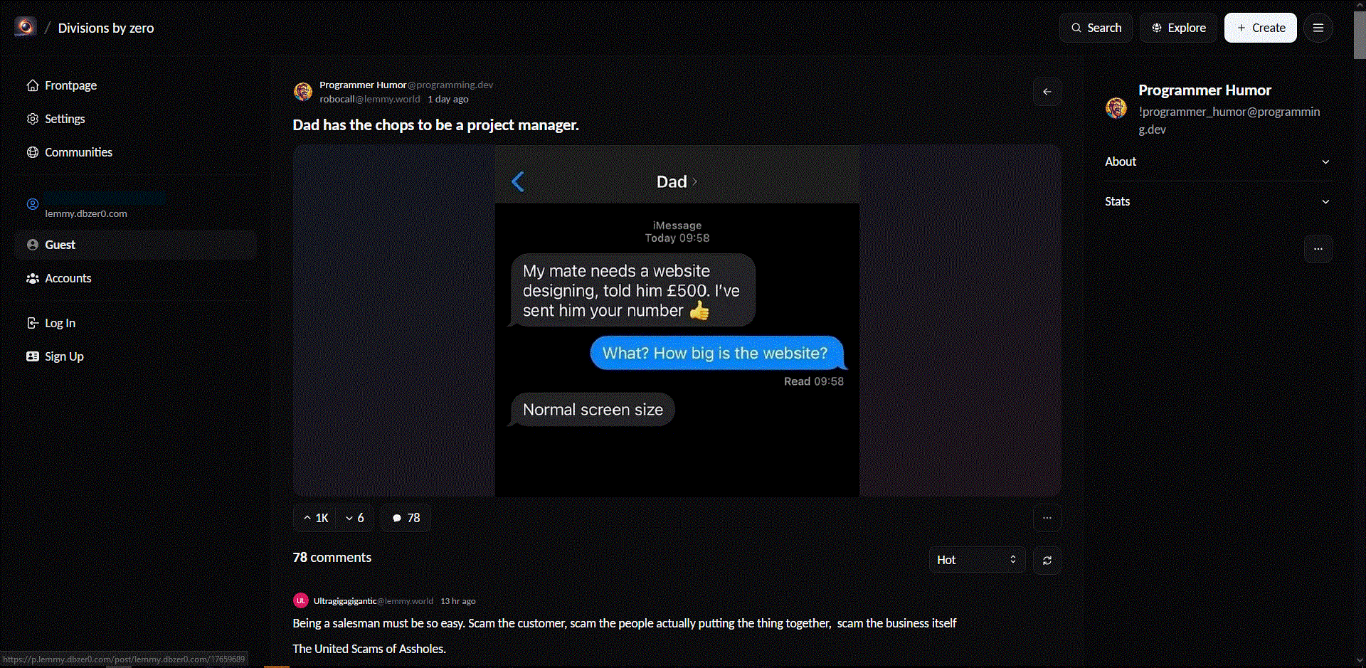
robocall@lemmy.world to Programmer Humor@programming.dev · 7 months agoDad has the chops to be a project manager.lemmy.worldimagemessage-square87fedilinkarrow-up11arrow-down10
arrow-up11arrow-down1imageDad has the chops to be a project manager.lemmy.worldrobocall@lemmy.world to Programmer Humor@programming.dev · 7 months agomessage-square87fedilink
minus-squareHopFlop@discuss.tchncs.delinkfedilinkarrow-up0·7 months ago Lots of websites with menus on the left! Can you send an example? I’ve only seen these foldout side bar menus.
minus-squareSpaceCowboy@lemmy.calinkfedilinkarrow-up0·7 months agoI’m looking at a page right now that has some buttons for “Subscribe, Create a post, Block community” on the side. But I guess it’s on the right side and maybe since they’re buttons it doesn’t count as a menu.
minus-squareKairuByte@lemmy.dbzer0.comlinkfedilinkarrow-up0·7 months agoTo be fair, those are less a nav bar and more contextual content. You likely also have the main nav bar along the top.
minus-squareStrykker@programming.devlinkfedilinkarrow-up0·7 months agoYouTube, google drive, Any readthedocs site with more than 1 page
minus-squareMicrow@lemm.eelinkfedilinkarrow-up0·7 months agoWell, the youtube menu is most likely positioned there because they dont want people to use it.
minus-squarepirrrrrrrr@lemmy.dbzer0.comlinkfedilinkarrow-up0·7 months agoEvery site in the early 2000s had a left nav menu
minus-squareAWildMimicAppears@lemmy.dbzer0.comlinkfedilinkarrow-up0·7 months agoLemmy Frontend called Photon:
minus-squareZagorath@aussie.zonelinkfedilinkarrow-up0·7 months agoWikipedia, especially the new design with the table of contents in the sidebar.
minus-squarePng_Yakuza@lemmy.worldlinkfedilinkarrow-up0·edit-27 months agoHere’s some articles written about it as well from NN group if you’re interested https://www.nngroup.com/articles/vertical-nav/ Here’s an article on user attention on website predominantly leaning left as well as a related topic https://www.nngroup.com/articles/horizontal-attention-leans-left/
Can you send an example? I’ve only seen these foldout side bar menus.
I’m looking at a page right now that has some buttons for “Subscribe, Create a post, Block community” on the side. But I guess it’s on the right side and maybe since they’re buttons it doesn’t count as a menu.
To be fair, those are less a nav bar and more contextual content. You likely also have the main nav bar along the top.
YouTube, google drive, Any readthedocs site with more than 1 page
Well, the youtube menu is most likely positioned there because they dont want people to use it.
Every site in the early 2000s had a left nav menu
Lemmy Frontend called Photon:
Wikipedia, especially the new design with the table of contents in the sidebar.
Here’s some articles written about it as well from NN group if you’re interested
https://www.nngroup.com/articles/vertical-nav/
Here’s an article on user attention on website predominantly leaning left as well as a related topic
https://www.nngroup.com/articles/horizontal-attention-leans-left/