

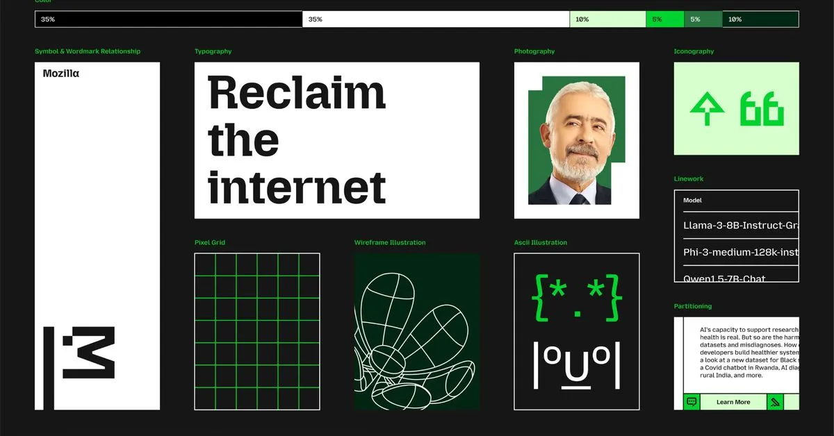
Mozilla has overhauled its branding to pay homage to its Netscape roots and better distinguish the wider organization from its Firefox web browser. The most notable change is to the company’s logo: what was previously a sans-serif wordmark styled as “Moz://a” has been updated to correctly spell out the Mozilla name, featuring a new customized typeface and an M-shaped flag.
According to Mozilla, the flag symbolizes the brand’s “activist spirit.” That fits with the image that the Mozilla Foundation, which is leading the company, is attempting to build: describing itself as “a non-profit organization that promotes openness, innovation, and participation on the Internet” and regularly releasing privacy reports that investigate tech companies’ policy and security practices.
I saw a discussion on HackerNews where one person claimed a rebrand is “almost always a sign of distress”, which seems far more speculative than informative. I tried looking it up, and while distress might be one possibility, it’s only one of many. Some companies might think their logo is outdated, and choose to update it. That might be especially true for tech companies, where style changes rapidly.
Another possibility I saw was that companies will change branding when they are trying to change direction. Apparently the Steve Teixeira layoff was actually more about AI and Mozilla Social than I had anticipated (he was pushing against AI, apparently, and mozilla.social was his baby), so this might coincide with a full embrace of AI or some other change.
It’s a real shame the process for the previous logo wasn’t followed again. I liked the previous logo, too.