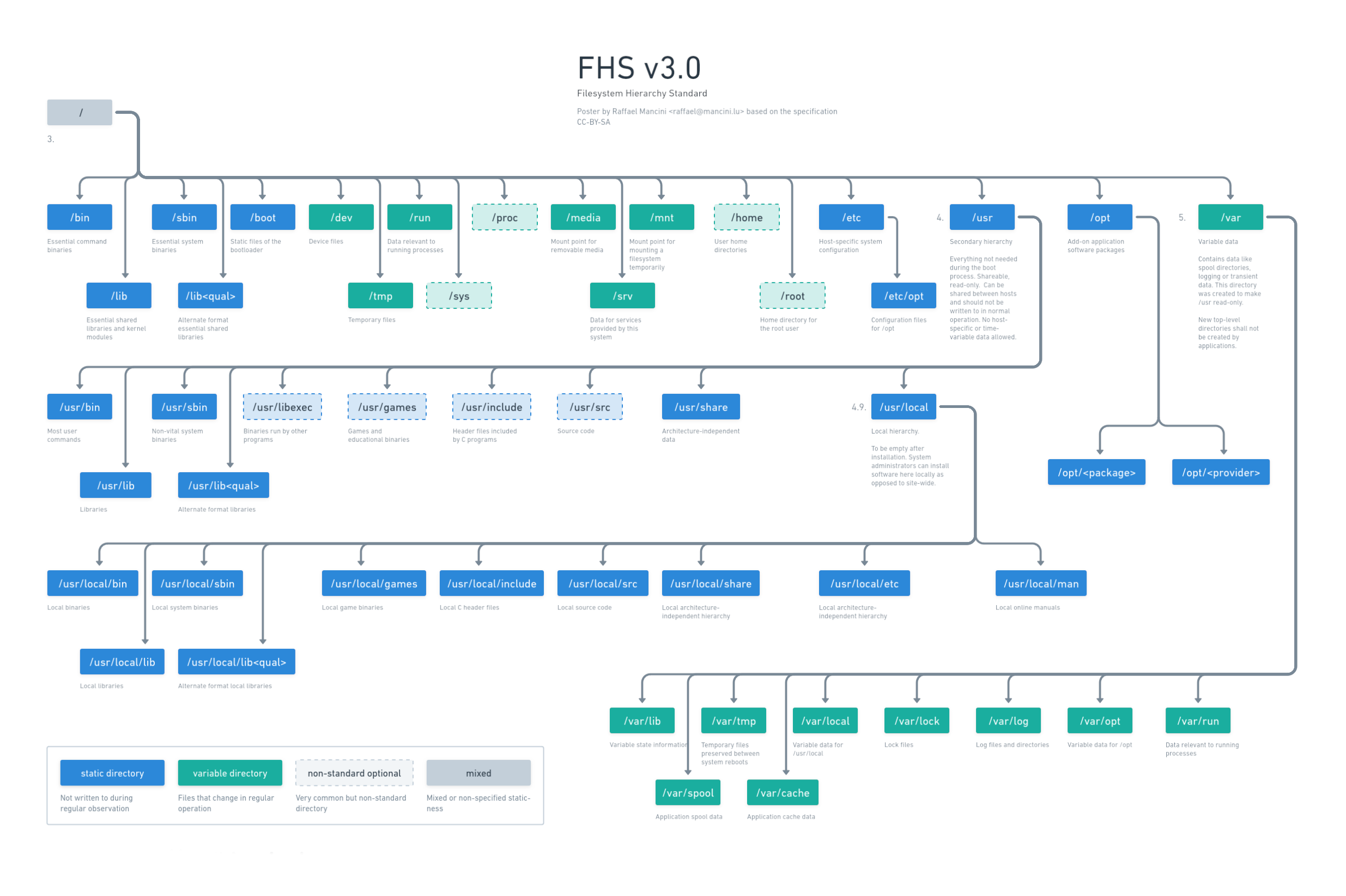
Hey, I’ve recently designed a Poster about the FHS since I often forget where I should place or find things. Do you have any feedback how to make it better?
I updated the poster: https://whimsical.com/fhs-L6iL5t8kBtCFzAQywZyP4X use the link to see online.

Dark mode

Old version


This is a very useful, very well done chart, congratulations.
But what a mess is FHS. Easily the worst thing of linux design for me